Potato Production in the United States
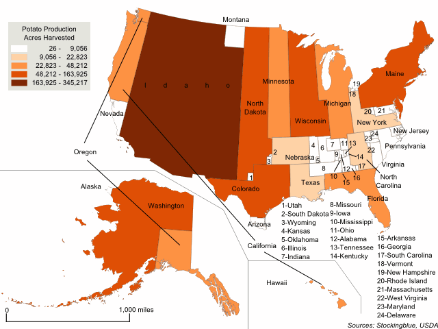
This week, the focus is on common Thanksgiving foods and which states produce them. The geographically accurate cartogram above redraws the states' sizes based on potato production. Specifically the number of acres harvested. All 50 states produce the crop but there is one clear leader in the production of potatoes accounting for nearly one-third of the acres dedicated to the root: Idaho.
Green Bean Production in the United States
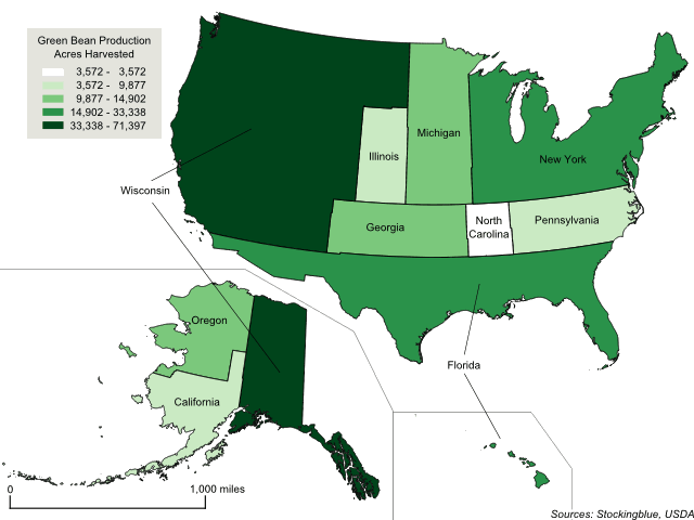
This week, the focus is on common Thanksgiving foods and which states produce them. The geographically accurate cartogram above redraws the states' sizes based on green beans production. Specifically the number of acres harvested. Only 10 states produce the bird and of the 10, the USDA publishes complete data on only six of them due to the other four states having few producers which would make it easy for their competitors to know how large their operations are.
Turkey Production in the United States
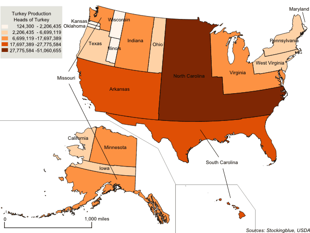
This week, the focus is on common Thanksgiving foods and which states produce them. The geographically accurate cartogram above redraws the states' sizes based on turkey production. Specifically the number of heads of turkey. Only 24 states produce the bird and of the 24, the USDA publishes data on only 18 of them due to the other six states having few producers which would make it easy for their competitors to know how large their operations are.
Pumpkin Production in the United States
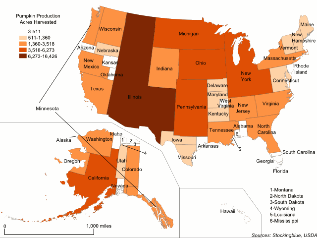
This week, the focus is on common Thanksgiving foods and which states produce them. The geographically accurate cartogram above redraws the states' sizes based on pumpkin production. Specifically the number of acres dedicated to the pumpkin harvest. Every state produces pumpkins, but some dedicate so few acres to the crop that they barely show up on the map, namely Alaska, Wyoming, and Louisiana.
Cranberry Production in the United States
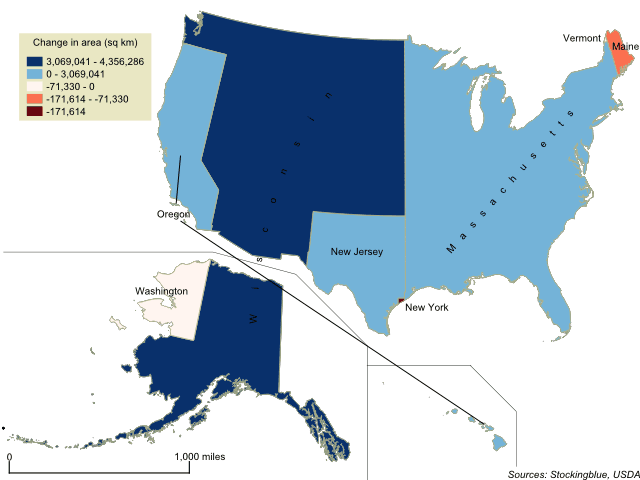
Where does Thanksgiving dinner come from? This week, the focus is on some staple Thanksgiving foods and which states produce them. The geographically accurate cartogram above redraws the states' sizes based on cranberry production. There are only a few states that produce the fruit according to the United States Agriculture Census.
The United States' Borders Based on Per Capita GDP
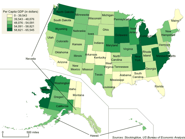
The geographically accurate cartogram above represents the states' boundaries based on per capita GDP. In this metric, all 50 states have similar areas as there is not much fluctuation from state to state.
The United States' Borders Based on Gross Domestic Product
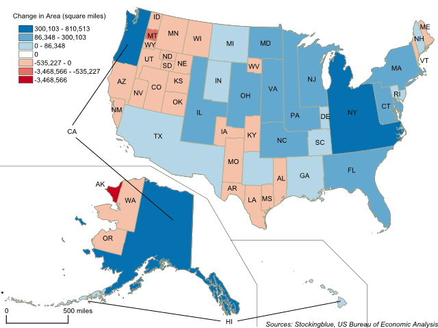
The geographically accurate cartogram above represents the states' boundaries based on gross domestic product. California, New York, and Texas take up large swaths of the country while Alaska nearly loses all of its territory.
The 2016 Presidential Election Cartogram Based on Electors
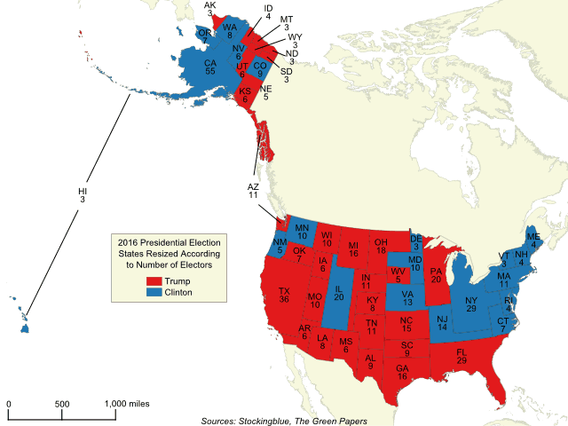
The geographically accurate cartogram above represents the 2016 presidential election with states resized according to the number of electors they have. The more electors a state has, the larger it is on the map. Compared to traditional maps, this map shows the electoral vote in a more accurate way painting the entirety of the United States with the appropriate amount of each color.
The United States' Borders Based on Population
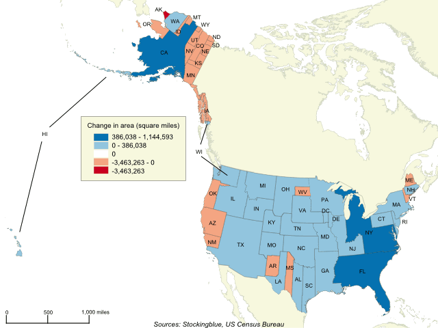
The geographically accurate cartogram above represents the borders of the states in the US based on their population. California becomes the largest state by far while Massachusetts, New York and Florida dominate the east coast. Texas takes over the Southwest while Alaska loses the most territory.
The 2017 Virginia Gubernatorial Race Based on County Population
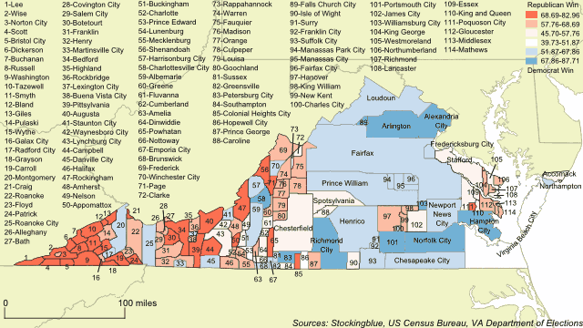
The geographically accurate cartogram above represents the Virginia governor's race results based on the population of each county. The more populous a county is, the larger it is on the map. Looking at a map of Virginia with the results of this race, the entire state is painted red leading the casual observer to believe that the Republican candidate, Ed Gillespie, won the race. However, the map above shows that those small pockets of blue are very populous and what they lack in geography they more than make up for in votes and it gives a better picture as to how the Democratic candidate, Ralph Northam, won the race.
OlderNewer