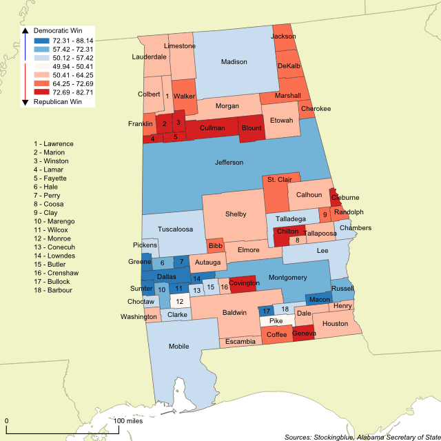
Cartogram of the 2017 Alabama Special Senatorial Race

The geographically accurate cartogram above resizes the counties based on the number of votes cast in the Senate race between Republican Roy Moore and Democrat Doug Jones. The more votes cast in a county, the larger it is on the map. This cartogram shows that Jones won the four largest counties (Jefferson, Madison, Mobile, and Montgomery) whereas Moore won the fifth and sixth largest counties. It proved not to be enough to get him past the post.
What to Look for in the 2017 Alabama Special Senatorial Race

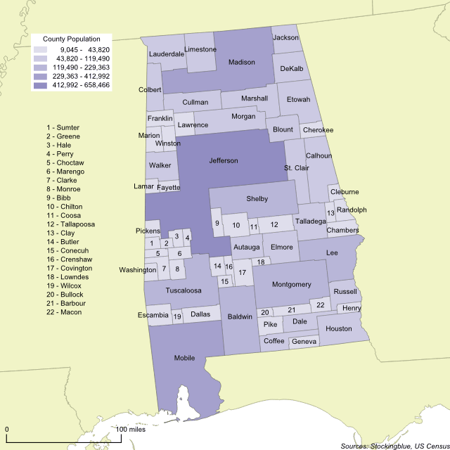
The geographically accurate cartogram above represents the population of Alabama's counties. The more populous a county is, the larger it is on the map. This cartogram shows that Jefferson, Madison, and Mobile are the most populous counties by far and together the three counties account for just under 30 percent of the state's total population. This, in a state with 67 counties.